Alerts
Alerts are used to attract user's attention for important information without interrupting the user's flow.
Example of Alert
Alerts are available in 8 types- primary alert, secondary alert, success alert, danger alert, warning alert, info alert, light alert, dark alert
To use this alert just use class name alert-boxand also add class according to alert type- alert-primary, alert-secondary, alert-success, alert-danger, alert-warning, alert-info, alert-light, alert-dark( For e.g class="alert-box alert-primary")
You can copy html part from below code snippet.
Avatar
Avatar can be used to show user's profile picture on profile information page, on navigation bar, in blogs grid items.
Example of Avatar
Avatar is available in 5 different sizes. You can use image in Avatar. You need to include class avatar and for size add class according to size avatar xl-size, avatar l-size, avatar m-size, avatar s-size, avatar xs-size(For e.g. class="avatar avatar-xl-size")
Badges
Badges are being used to display a notification count or status information
Example of online status Badge
We have 3 types of status badges that can be integrated with Avatars. You can show colors to show the online status of user
Check code below to copy the html part as follow below.
Example of icon badge
We have some icon that can be used to show update or notification
Cards
Card are used to show user related data, like coupon & product details.
Example of Cards with badges
Cards with badges can be use as a coupon in E-commerce website.
Check code below to copy the html part as follow below.
Coupon
85% OFF
use
#6958A4B3
Example of Cards with dismiss
Cards with badges dismiss button can be use as per the UI requirements.
Coupon
85% OFF
use
#6958A4B3
Example of cards with text overlay
Card's image may have a margin or it can be full-bleed. By default card's images are full-bleed. If you want image to have margin, Copy below code and put your desired text and image and you are good to go.
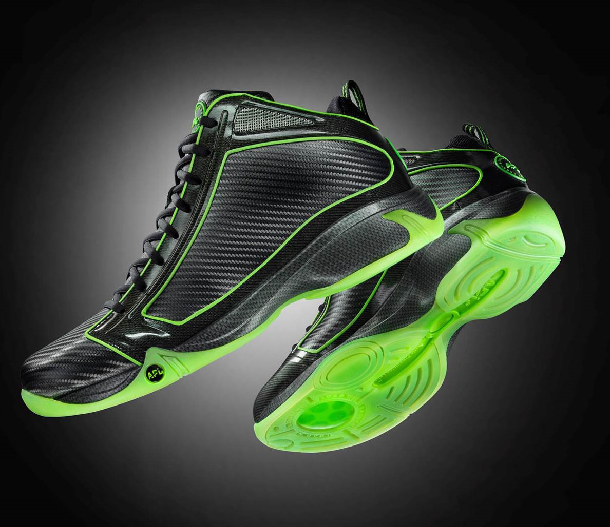
Sports shoes for men
Price: 1199
MRP: 3999
Review: (17)
Example of text only card
Card's image may have a margin or it can be full-bleed. By default card's images are full-bleed. If you want image to have margin, Copy below code and put your desired text and image and you are good to go.
Example of Vertical Card
Card's image may have a margin or it can be full-bleed. By default card's images are full-bleed. If you want image to have margin, Copy below code and put your desired text and image and you are good to go.
Sports shoes for men
Price: 1199
MRP: 3999
Review: (17)
Sports shoes for men
Price: 1199
MRP: 3999
Review: (17)
Example of Horizontal Card
Card's image may have a margin or it can be full-bleed. By default card's images are full-bleed. If you want image to have margin, Copy below code and put your desired text and image and you are good to go.
Sports shoes for men
Price: 1199
MRP: 3999
Review: (17)
Sports shoes for men
Price: 1199
MRP: 3999
Review: (17)
Images
Images can be responsive to fit the parent's width, and also can be customised to be round shaped
Example of Responsive Image
It's height will get adjusted by keeping the aspect ratio same. If you want to change the aspect ratio, you will have to crop the image.

Example of round Image
It's height will get adjusted by keeping the aspect ratio same.
Input Components
There are form fields listed below and form validation is also styled.
Example of Active form fields
Give textual form controls
Text Utilities
Check out below text utilities.
Example of Heading text
For heading you can use h1, h2, h3, h4, h5, h6 elements. The same font-styling is present for class names h1, h2, h3, h4, h5, h6 class. You can add one of these classes to style the text.
I'm heading 1
I'm heading 2
I'm heading 3
I'm heading 4
I'm heading 5
I'm heading 6
small text
small text are required in product card, and in other component. you may use it as required
Example of small text
Example of small text
Example of small text
Example of small text
Example of small text
Example of small text
Gray text
Here are some of the example of gray text in different style
Example of gray text
Example of gray text
Example of gray text
Example of gray text
Example of gray text
Example of gray text
Center text
Here are some of the example of center text in different style
Example of center text
Example of center text
Example of center text
Example of center text
Example of center text
Example of center text
List
Lists can be used at so many places, navigation bar, stacked notifications, article pages, etc.
Example of Unordered List
Add class according to bullet style. Copy html code below and add your desired list items. As circle type use the class style-type-circle, for filled circle type use style-type-disc and for square type use style-type-square
- List item 1
- List item 2
- List item 3
- List item 1
- List item 2
- List item 3
- List item 1
- List item 2
- List item 3
Example of Ordered List
Add class according to bullet style. Copy html code below and add your desired list items.
- List item 1
- List item 2
- List item 3
- List item 1
- List item 2
- List item 3
- List item 1
- List item 2
- List item 3
- List item 1
- List item 2
- List item 3
- List item 1
- List item 2
- List item 3
Example of Ordered List with no bullets
Add class according to bullet style. Copy html code below and add your desired list items.
- List item 1
- List item 2
- List item 3
Example of List with inline items
Add class according to bullet style. Copy html code below and add your desired list items.
- List item 1
- List item 2
- List item 3
Example of Notification Stacked List
This is stacked list without bullets. We can add desired component inside li element. Check below code for cards in stacked list.
Navigation
Navigation bar is used to navigate through the web apps or websites. This navigation component is responsive. It is a hamburger menu in medium and small devices
Example of Navigation
Navigation is broken in 4 parts:
Modal
Modals are positioned over everything else in the document and remove scroll from the page. It gets closed only with close button on modal pop-up.
Example of Modal
Rating
Rating components can be used as read-only badge or in reviews section. Can be used in reviews section
Example of read-only ratings
Add checked class with fa fa-star to increase number of star
Toast
This component can be used for toast or snackbar component. Toast is mostly used to show feedback message. Snackbar is to used show message that need user action
Example of Toast
Use the classtoast-success or toast-erroror toast-info as per the requirement
Saved! ✕
Not Saved! Try again later. ✕
Saving to server...✕
Grid
Use grid when you want sections in view. Check below some examples of side by side cards.
Example of side by side layout
Use the class grid-simplified in the parent div element, follow the code below
Two items in a grid
Use two item in a grid when you want sections in view.
Example of two item layout
Use the class grid-two-items in the parent div element, follow the code below
Item 1
Item 2
Three items in a grid
Use two item in a grid when you want sections in view.
Example of three item layout
Use the class grid-three-items in the parent div element, follow the code below
Item 1
Item 2
Item 3